The woman in this painting is Raphael's mistress. That in itself is interesting, because during that time period, it seems like that would be something that painters would stray away from. Also, his use of seeing and not seeing is intriguing. He has her stomach draped with what seems like a clear kind of cloth, but he lets her breasts be exposed clearly. The volume in this painting is incredible too. By glancing at it quickly, it almost seems like a photograph, not a painting, and being able to achieve that is something that would be amazing.
Friday, February 29, 2008
John Haenle - Raphael's Fornarina
The woman in this painting is Raphael's mistress. That in itself is interesting, because during that time period, it seems like that would be something that painters would stray away from. Also, his use of seeing and not seeing is intriguing. He has her stomach draped with what seems like a clear kind of cloth, but he lets her breasts be exposed clearly. The volume in this painting is incredible too. By glancing at it quickly, it almost seems like a photograph, not a painting, and being able to achieve that is something that would be amazing.
Janice Kim: Velazquez "The Toilet of Venus"

According to Wikipedia, this is the only surviving female nude by Velazquez and one of only two nude paintings in 17th century Spanish art because of censorship by the Spanish Inquisition. However, as the king's painter Velazquez seems to have been able to draw a nude and get away with it :)
I like this painting because I find it unusual that I only get to see the back of Venus, unlike in many other works of art concerning Venus. I also find it intriguing that the mirror's angle is not supposed to reflect Venus' face but that it does anyway, and that her face is so blurry that it's hard to really see what she looks like. Maybe Velazquez found it a demanding task to paint the face of goddess of beauty...
Tuesday, February 26, 2008
Jee Hyun Choi: Andrew Wyeth

This is the painting I had in mind for a while for this particular post. I first saw this painting, Christina's World, by Andrew Wyeth in a Smithsonian magazine issue about two years ago. I forget many paintings, but this one has stuck in my mind. I think the reason might be in Wyeth's placement of form. The basic forms in the painting are rather simple; a tangled-up woman, a house, and a line that represents the horizon diving them up. What makes these forms have such a big impact, though, is that there are spaces in between them. A vast space of the canvas is waves of colors--the sky and the field. Wyeth, by placing these forms in such manner (which seems quite unique and complex to me), creates a sense of loneliness, forlornness, and estrangement.
(Whew!I apologize for the late posting-it's been an internetless weekend and week)
Caitlin Clark

So this painting uses basic shapes in the construction of the items on the table... but the use of the shapes here proves that this technique alone does not make it a successful piece. To me the composition lacks purpose and I did not feel any sort of emotional reaction because of it. Even the slight abstraction in the forms takes away from influence of shape and makes it even more unappealing.
Oona Curley - Magritte
The image “http://static.flickr.com/30/45022712_d3151757f1.jpg” cannot be displayed, because it contains errors.
Follow the link and you'll find Magritte's famous bowler hat man painting. This image is composed of many smaller, simpler shapes - the man's body can be seen as a cylinder, or even a rectangle, the head as a sphere/circle, the apple as a sphere, and the bowler hat as a hemisphere or rounded cylinder. It is interesting how even these simple shapes can resemble each other - the bowler hat could be seen as a cylinder with a rounded top or a very squarish hemisphere.
Monday, February 25, 2008
Ariel Isaacs: Les demoiselles d'avignon

I think that this image shows how picasso is able to translate the forms of women into a few simple, and repeating shapes. He manages to express the women while at the same time, abstracting their forms to their essence. Hips are reduced to triangles, breasts to squares, etc. I really like how he takes an overwhelmingly complex composition and then translates in a completely novel way. Even the faces use very simple shapes, and even though they are clearly not realistic, they manage to somehow be true to life.
Ju Li Khing: Vortex lines

Asad Jan


At the same time, there are objects we see these days that are in fact made up of a composition of other shapes. A soccer ball for example is a repetition of hexagons and pentagons that makes the pattern on a perfect sphere.

Then there are far more complex images that one needs to concentrate on a lot harder to comprehend. This is a painting titled “The Card Players,” by the De Stijl artist Theo van Doesburg. Even though in real life an image of card players would have very few rectangles other than the cards themselves, I think he has cleverly emphasised the subject matter of the painting by portraying the entire thing using geometric shapes that are essentially composed of black and white rectangles. I feel that this is a good way of reiterating the fact that all objects can in fact be broken down into simpler constituent shapes even though they may not at first seem to fit at all.
Rachel Rieder- The Escher Form
The blog isn't letting me upload the image for some reason, but I chose a piece by Escher, which is a black and white of birds "becoming" fish. As the viewer's eye travels down the page the previously negative space turns takes on a form from the abstract shape it once was into a new object. The transition is done gradually, with an expert degree of subtlety and detail. Escher's work never ceases to amaze me.
John Haenle - Le Viaduc à L’Estaque (The Viaduct at L'Estaque)

This painting is by Georges Braque. The use of simple cubes and pyramids is prevalent in the painting, but it still manages to show depth in the houses and the viaduct. Also, the perspective of each house is different which adds to the overall feel of the painting. It's as if he chose different vanishing points for each house, which works well because it makes the houses kind of zig-zagged and it leads your eyes from the bottom up to the top smoothly.
Lucinda Ng- Photomosaics

A photomosaic is basically a picture compiled of many smaller pictures. It's usually done by dividing a large picture or photograph into lots of small sects and then replacing every sect with another picture or photography of the appropriate average color. It always seems to amaze me what the artist can put together and how the eye absorbs the picture/photograph as a whole, rather than every individual one. It really shows how important color can be in a piece of art; we often perceive like colors as similar things, like in the case of photomosaics but we also perceive like colors as very different things, for example a picture had both sea and sky in it. The simple repetition of color can have a huge effect to a picture.
Sunday, February 24, 2008
Serena Ho- Tessellations by Escher

I chose this image because I think it's brilliant. It's evident how Escher utilizes a simple shape and creates a unique pattern out of them by fitting the shapes together in a tessellation. Yet what is really unique about this image is the way that Escher morphs the shapes on the bottom- the fish- seamlessly into the birds on the top of the drawing. Although the image is two dimensional and there is no shading or color, Escher still creates a complex and intriguing piece from the simple silhouettes of fish and birds.
Asia Del Bonis - Safety Pin Spiral

This artist used repetition of his medium to create a downward spiral. A safety pin has a distinct shape that is nothing like a spiral. The safety pins are similar to a line on a page. When one line is put on a page, it doesn't look like anything special or unique. When many lines are put together to form a shape, something with dimension and volume, that is when art is created. Here the pins transform themselves- almost to the point where the viewer doesn't notice the familiar shape of the pin.
Ephraim Dagadu - Cubism
Lauren Reimnitz - Simple form, Complex manner (Escher)

This goes along with Andy's post of Escher's use of triangles... In this drawing, Escher uses spheres and a continuous spiral to depict to heads floating in space. The artist could merely have drawn the two people, but instead he divides up their faces and creates a continuous spiral of each of their faces in a loop, while the floating spheres help to add perspective.
Meleha Ahmad - Gustav Klimt, The Kiss

Okay, so I don’t know if my blog really answers Ian’s question, but he says to take creative risks, so here it is! This image is probably one of my favorites; it is passionate, no doubt, but there is also a sense of peace that it exudes. When I ask myself why exactly it is peaceful and why exactly it is passionate, I cannot help to recognize the repetition of rectangles on the man’s clothing, and the repetition of little circles on the woman’s. Each one of these is, in fact, a simple shape, but their repetition creates a much more complex, even slightly hypnotic texture for each of the lovers in the piece. However, the idea of how these shapes play off one another, the smooth circles and the pointy rectangles creates a tension in the picture between the lovers that emanates passion in the piece.
Saturday, February 23, 2008
Janice Kim: Marcel Duchamp - Nude Descending a Staircase, No. 2

I chose this painting as an example of art where an artist uses a simple form in a complex manner. Marcel Duchamp decided to draw a woman coming down a staircase, which I think would have been quite a simple image had he not decided to draw the entire trace of the motion instead of capturing a moment, which made the painting exceedingly complex.
Janice Kim: Perspective
Friday, February 22, 2008
Andy Furnas: Mixture between perspective and simple goemetric shapes

This image shows how if you have a vanishing circle, instead of vanishing points you can think about a curved space, called hyperbolic space. In this perspective things looked warped, but in fact, all of the triangles in this image are THE SAME! i.e. with the same area and angles!! I know it seems crazy, but it's true. This also shows how using simple geometric objects, like triangles something totally crazy and cool looking can be seen!
Thursday, February 21, 2008
Lucinda Ng- Linear Perspective

M.C. Escher used two-point perspective in this piece, "Ascending and Descending." The viewer can see the various sides of the building/castle from a bird's eye view. The building is cut up into chunks; there are obvious cubes and rectangular prisms that were put together after Escher drew them out separately. However, the never-ending staircase is pretty interesting in itself, asides from the two-point perspective.
ariel isaacs: Perspective

I chose the school of athens painting. this is a very famous by painting, who can be seen in the vatican in rome. The vanishing point is right above the head of socrates. Putting the vanishing point there draws the eye towards his head, and makes him the emphasis of the tableau. This was one of the first paintings to exhibit linear perspective.
Ephraim Dagadu - Farm Perspective
Asia Del Bonis - Salvador Dali Perspective

In this piece by Salvador Dali, there are 3D boxes as well as humans. In this two point perspective piece he almost teaches the viewer how to correctly place an inanimate object with an animate object in art with perspective. I also like how there's a clear emotion present and how when he places plain cubes in the artwork, it almost makes the subject matter less intense.
05 - Robert Taj Moore - Linear Perspective
Sorry, here is the link for my picture, I couldn't load it for some odd reason. Anyway, this is my example of linear perspective. One can really see the "illusion of deep space" here, the tracks seem to stretch on endlessly. It looks like there is only one vanishing point here, unless I am mistaken, which is completely possible.
Asad Jan - Perspective
Wednesday, February 20, 2008
Lydia Magyar - Ghiberti's Bronze Panels


These images are panels from Ghiberti’s Gates of Paradise on the Baptistery in Florence. The perspective - one and two point - is convincing and far ahead of Ghiberti’s time (the gates were completed in 1401). Ghiberti would go on to teach painters like Donatello and inspire works by Rodin (Gates of Hell).
Linear Perspecitve: Meleha Ahmad

The photograph below is one that I took at the Badshahi mosque in Lahore, Pakistan. I never really noticed it before but I think this is a perfect example of linear perspective. The ceilings of each room in the Badshahi mosque are dome-like, so this picture does not have those characteristic slanted lines into each corner of the picture where the walls meet the ceiling (see picture to the right). Instead we have the top of the curve coming to each corner. The repetition of the doorways getting smaller and smaller helps create the image of deep space also, along with the distinct vanishing point that appears almost at the middle of the page.

Tuesday, February 19, 2008
Jee Hyun Choi - Renoir


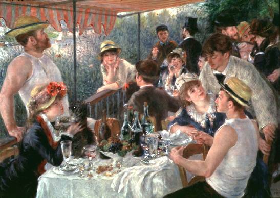
This week ,I discovered a ton of artists while searching for an image I can copy. One of them is Renoir. I'm posting a couple of his paintings. His paintings have light, playful brush strokes and the colors are usually bright. His paintings seem to be teeming with conversations.
I bet he was an optimist.
Sunday, February 17, 2008
Serena Ho- Linear Perspective


On the right is Salvador Dali's Face of Mae West. The use of perspecive is especially obvious here. The floorboards are clearly converging at a vanishing point somewhere beyond the wall.
Thursday, February 14, 2008
Blog's New Feature: LINKS.
Since we make a substantially-sized class, I thought it nice if we shared resources (because Google only takes us so far) Therefore, if you look to the right of this blog, I have added a box of links (it currently has three links in it - only)
1) If anyone thinks it's useless/doesn't like it/doesn't like me and thus by extension doesn't like the new addition, feel free to remove it.
2) At the same time, feel free to add links to it.
3) If there's anyone out there who knows how to separate the links into separate lines, please do repair it because no amount of spacing I do does anything to it.
Good luck on the grid assignment!
- Jules
Tshirt facebook photo album:
Below is a link to a facebook album of everyone's t-shirts! Feel free to tag yours. I'll try to get them posted on the blog some time soon.
http://www.facebook.com/album.php?aid=2003990&l=fed99&id=1368330007
Have a great weekend!
http://www.facebook.com/album.php?aid=2003990&l=fed99&id=1368330007
Have a great weekend!
Tuesday, February 12, 2008
Asad Jan

It's mind boggling to try and think of all the things that the human eye is unable to

Monday, February 11, 2008
Ju Li Khing: The Afghan Girl

When I was young, I liked perusing through The National Geographic for pictures like this that portray a myriad human emotions with one glance. I remember feeling slightly cowed by this picture; by the brazen green eyes that seemed to jump out of the page - it's almost as if she was a real person before me instead of just a photograph. There is fear, wariness, and an overwhelming strength resonating that is unusual for a girl of her age. It is hard to believe now that this girl was 13 years old when this photo was taken. Most of all, this is the most beautiful real person I have ever seen.
Ephraim Dagadu - E-motion

This is the Dario Gagula's E-motion concept car from Peugeot's 4th Design Competition. I've always loved cars and I feel that concept cars represent what could happen if a car could be more form than function. I picked this particular car because I enjoy its smooth, curved design and I really like the design of its wheels, which I find unique. They remind me of computer circuitry.
Lucinda Ng- The Visages of the Elderly

The face and expression of a person tell a lot about him or herself. But to me, faces are also art, especially the faces of the elderly. Each wrinkle and crease on their faces do not only form through time because of age but also form from experience. When they develop on their faces, they look ever so careful and delicate, in a way, ironically, almost flawless. Elders' faces are so textured and comprehensive; every emotion is displayed with so much more detail and passion.
Ariel Isaacs: FDR by Tina Mion

This is a portrait of FDR by Tina Mion. We have a couple of her pieces in our house, and she is a family friend. She did a series of all the presidents as cards in a deck, though this president is not from that series. Here, she shows FDR as four stills from an old movie, and his cigarette gets shorter and shorter until, in the last frame, it is out. I really like this painting (it is a painting, oil on canvas, no photoshop involved) because it expresses time in a unique way, and this era in american history in a very powerful way. FRD slowly ages from frame to frame, as the american people and that era of history ages with him. I think that it is a very unique and creative way to portray a president.
Serena Ho- Painting

This is a painting done by my friend at RISD. I just love the composition, how you can only see the father's legs, because it seems to show the world through the little girl's eyes. The soft colors accentuate the mood of youth and innocence. And most of all, it just really impressed me that someone my age painted this!
04 - Robert Taj Moore - Derek Sammak - "Old Man"
Andy Furnas: Aleph


Consider the Aleph and let your mind wander. Allow yourself not to gaze upon its beauty, but instead be captivated and engrossed by the eyes of those who see it. Imagine you see all shades of reflection at once–the swirl of colors–the eye within the eye... the world within each world. Take it upon yourself to just let go and trust in the Alpeh. Fall into the eyes of others and get lost in the universes hidden there.
Sunday, February 10, 2008
Lauren Reimnitz - what i like photo
this is a picture i took while in San Luis Obispo, California near the beach. I'm a huge nature fanatacist, love scenery, love water being in images, sunsets, and colors one doesn't see often. So in other words, I've always really liked this picture a lot. It doesnt seem to me to be a typical sunset picture with the blues, greens, pinks, and purples one often sees, but is a more simple sunset. However, I really like the hues of yellow and orange in the photo and how the cloud just barely covers the sun. This picture always makes me feel really, really peaceful.
Caitlin Clark

In high school one of my friends did a replication of this for art and I always thought it was odd that silly comics in the Sunday paper could evoke a sincere emotional response. This picture specifically is so intense, yet all it is is bold colors and lines... its almost like it is breaking the situation down to the only elements necessary to get the message across. In this picture, the tears are my favorite part because they could totally be the result of SO many different situations, which really makes you wonder how applicable it is to your own life.
John Haenle - Christian Science Center, Boston
This is a picture that I took of the Christian Science Center in Boston. Boston is an amazing city with lots of great photo opportunities, but I like this one in particular because of the lighting on the building itself. It illuminates the building, but also provides a nice contrast between the black sky and the lit building. The reflecting pool in front of it also provides the photo with some great reflections of lights around the building. Looking at it also reminds me of the fact that I actually am at college now, and I can decide to do something and just do it, without having to have permission, and this was the first time I went to Boston on my own. I know that may sound kind of stupid, but just knowing the fact that I am truly independent now is a cool feeling haha
Subscribe to:
Posts (Atom)